Contents on This Page
If you need help with any of our visual elements, please contact Colin Buckner, Art Director in University Marketing and Communications.
Primary Typeface
Our primary brand type family is Avenir Next. It is a versatile and modern geometric sans-serif typeface that functions well as body text and as headlines. Avenir Next has a clean design construction, approachable neutrality, and has been developed not only for print legibility but also to meet the demands of digital environments. Its wide range of weights, glyphs, and multilingual support makes it accessible and consistent on many different platforms.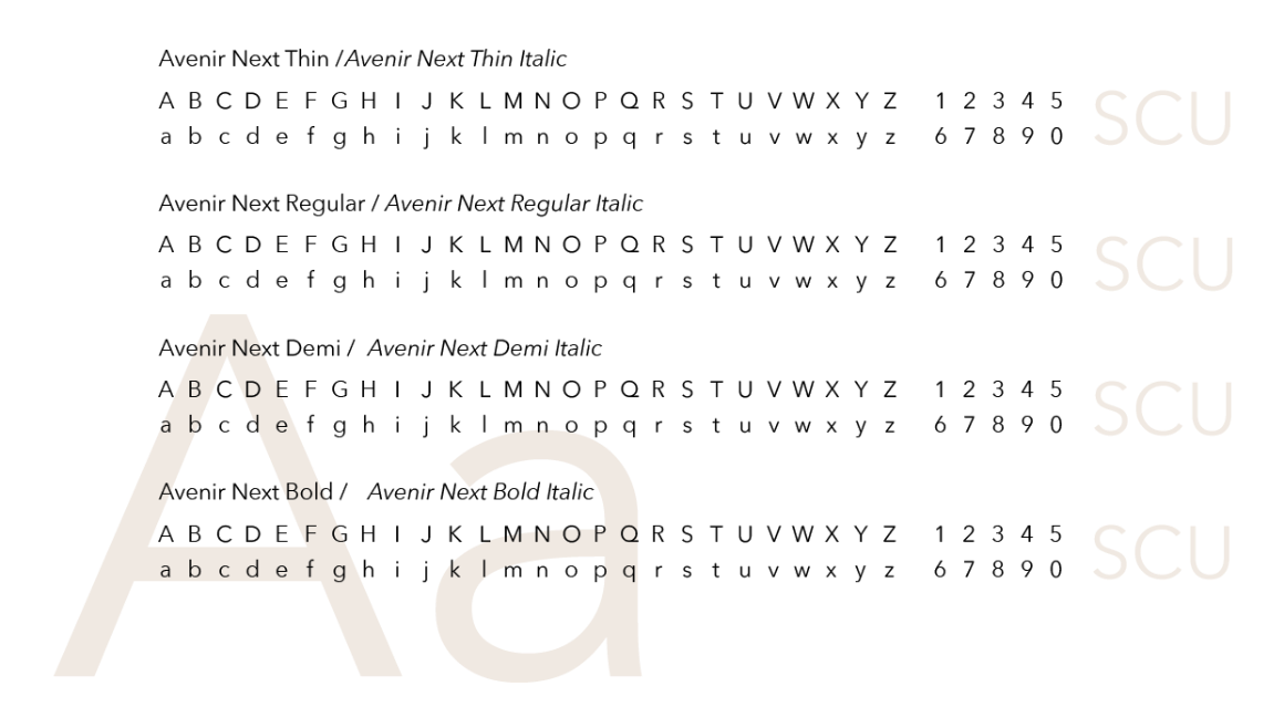
Secondary Typeface
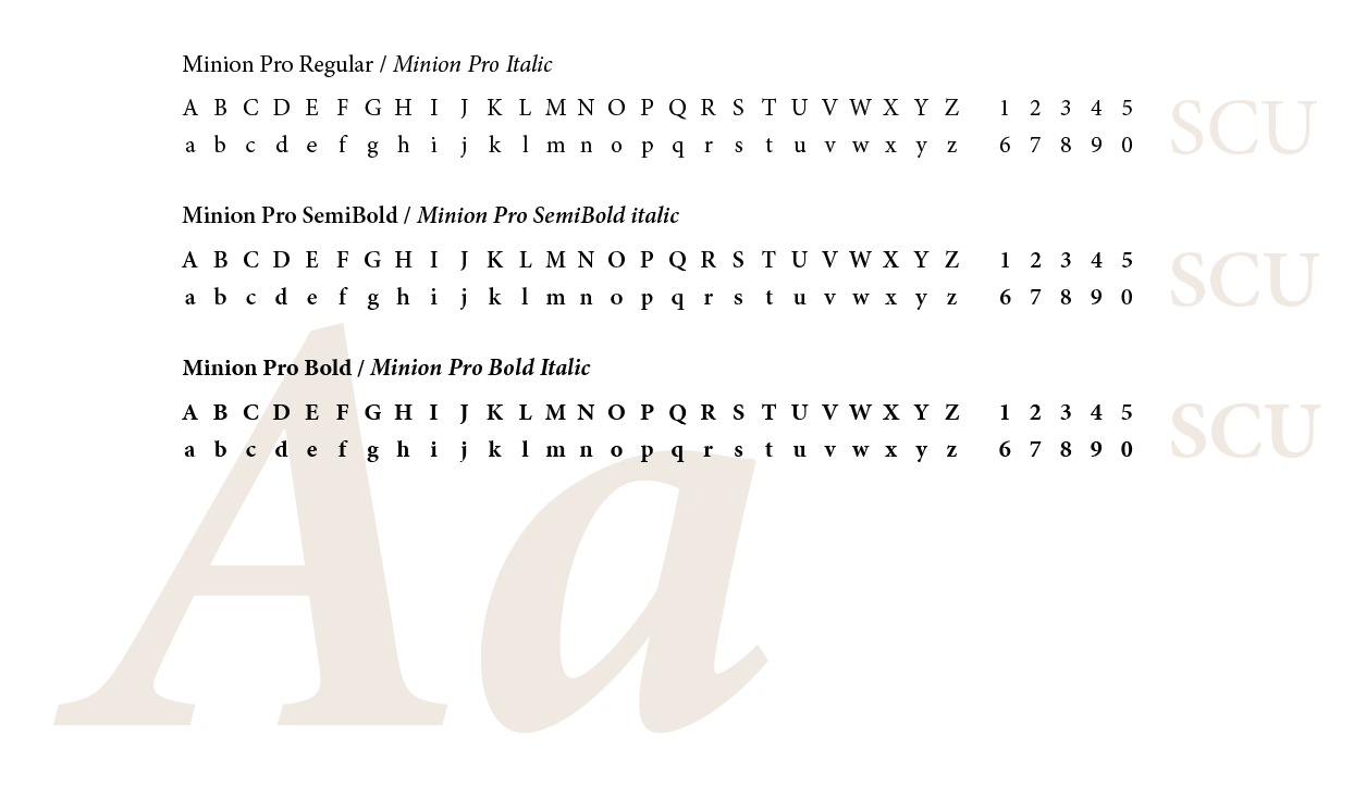
Minion Pro is our secondary brand type family. This supporting typeface is inspired by classic, old-style typefaces. It has balanced proportions, moderate contrast between thick and thin strokes, and is supported by serifs for enhanced readability. Suitable for both body text and headlines, Minion Pro combines classic aesthetics with modern functionality.
Minion Pro complements Avenir Next because of its understated elegance. Use Minion Pro for pull quotes and/or elevated communications that require an extra degree of sophistication, such as commencement announcements or letters from the President.
Alternate Typeface
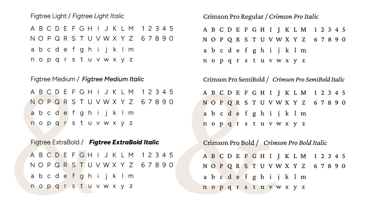
If our brand typefaces are unavailable, we have two substitutes. Whenever possible, we strongly encourage the use of our brand typefaces, but our alternates are suitable for general communications such as PowerPoint presentations and Word documents. In lieu of Avenir Next, use the typeface Figtree. In lieu of Minion Pro, use the typeface Crimson Pro.
Our alternate typefaces have been selected as substitutes because they are widely available and have many of the same design characteristics of our primary and secondary brand typefaces.
Google Font Download—Figtree
Google Font Download—Crimson Pro