Contents on This Page
For more information about logo usage, contact Colin Buckner, Art Director in University Marketing and Communications. If you’re unsure who the University Marketing and Communications partner is for your department or division, contact Harold Gutmann, Director of Brand and Marketing Strategy.
Tier 1 University Logos
Our University Logo, referred to as Tier 1 (T1) in our visual identity guidelines, is the most recognizable visual representation of Santa Clara University. The prominence of the Mission in our logo reflects its importance and historical significance. The Mission is placed on the horizon establishing a sense of place and dimension. The Mission Symbol is framed by a collegiate shield with the cupola reaching aspirationally outside the frame. The logotype is a core component of our logo, custom-drawn and inspired by classic serif typefaces with an emphasis on timelessness and versatility.
This logo serves as the primary mark for all communications—across our website, print materials, presentations, social media, and signage. By using this logo consistently, we create a cohesive visual identity that strengthens recognition and broadens awareness of the University, and its academic, administrative, and community units.
![]()
Our primary logo is the horizontal version, preferred for its flexibility and strong visual composition. The vertical version can be used when space is limited or when centered alignment is needed. Both versions are available in positive and reverse color options. While the full color is preferred, single-color versions are available for specific applications. Always use the approved artwork without modification.
Positive Logos
Horizontal logo
Vertical logo
Vertical stacked logo
Reversed Logos
Horizontal logo
Vertical logo
Vertical stacked logo
Incorrect Usage
The examples below highlight some, but not all, common misuses of our logo and seal. Never redraw or recreate any of our logos, including the Mission Symbol or Logotype. Any modification of our logos diminishes their impact and weakens our legal protection.
Do not use legacy logos to represent the University, administrative units, academic units, or any other units.
Do not add drop shadows or other effects to our logo.
Do not change the name, typography, form, size relationships, or placement of any components of our logo.
Do not change any of the colors within our logo.
Do not use our positive logo on dark backgrounds that don’t have adequate contrast or legibility.
Do not place our logos on background colors that are not specified in our color palettes.
Do not change or omit the white areas or modify or remove any parts of our logo.
Do not use our reverse logo on light backgrounds that don’t have adequate contrast or legibility.
Do not use our logo on any pattern, texture, or photograph that reduces readability.
Do not place our logo too close to another element, such as text or graphics, that violates our logo's clearspace.
Do not scale the logo to any proportions other than the original.
Do not use the University Seal as a logo to represent the University or any units.
Tier 2 Unit Lockups
Tier 2 (T2) includes units that are most closely aligned with our brand architecture system. The design, typeface, and size relationships have been carefully developed to create a strong presence for each specific unit, while maintaining a clear connection to Santa Clara University.
For access to our lockups, please reach out to your brand and marketing strategy partner in University Marketing and Communications.
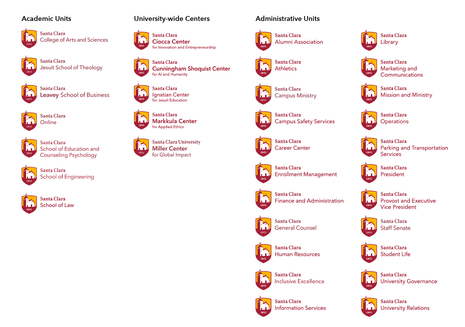
Current list of T2 Lockups for Academic Units, University-wide Centers, and Administrative Units
Tier 3 Unit Logos
Tier 3 units have a clear visual relationship with the University’s brand but do not use logo lockups. Instead, they feature type treatments that align with our logos but are not considered individual logo artwork.
All Tier 3 logos must be submitted to University Marketing and Communications for approval. Contact your Brand and Marketing strategy partner to initiate an exception request.
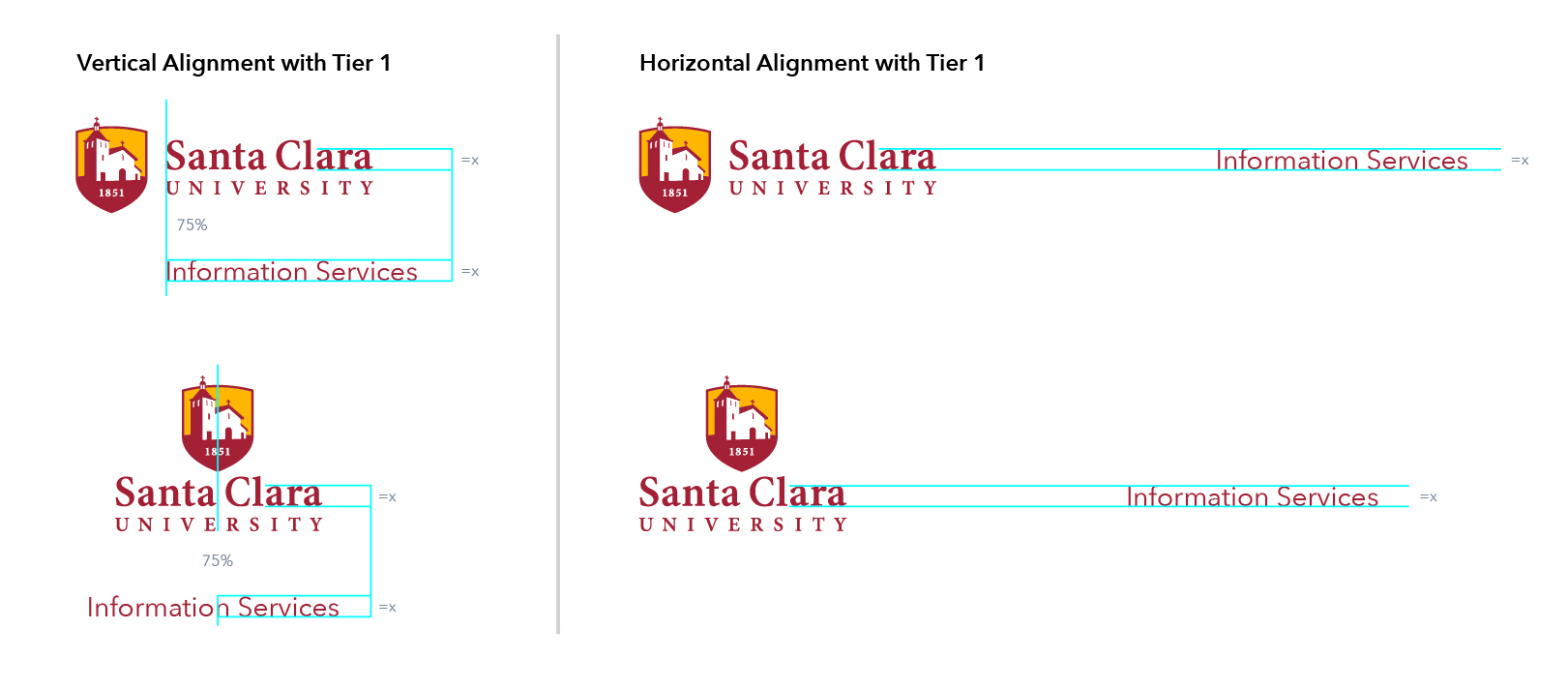
An example of a T3 Logo made for the Information Services unit, aligned with the T1 Logo
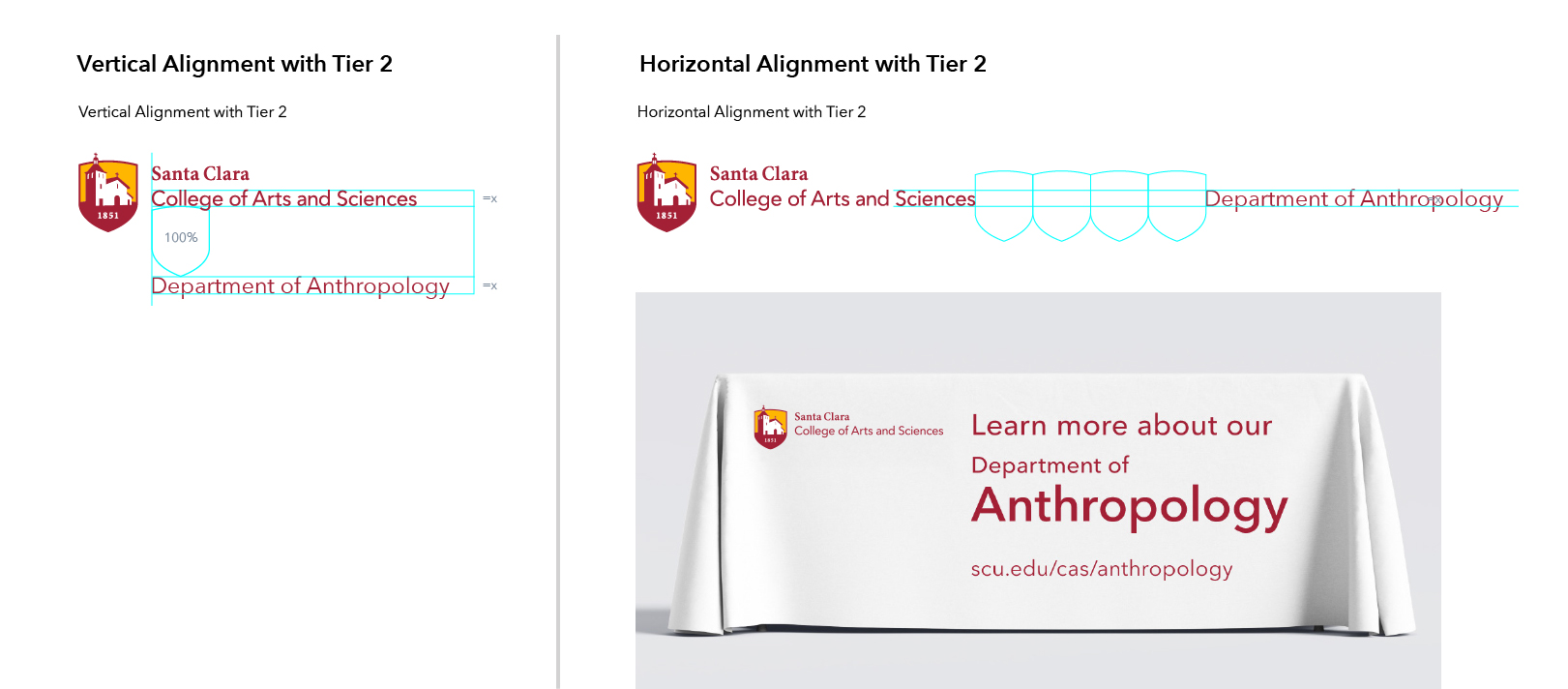 An example of a T3 Logo for the Department of Anthropology, aligned with the T2 Logo (College of Arts and Sciences)
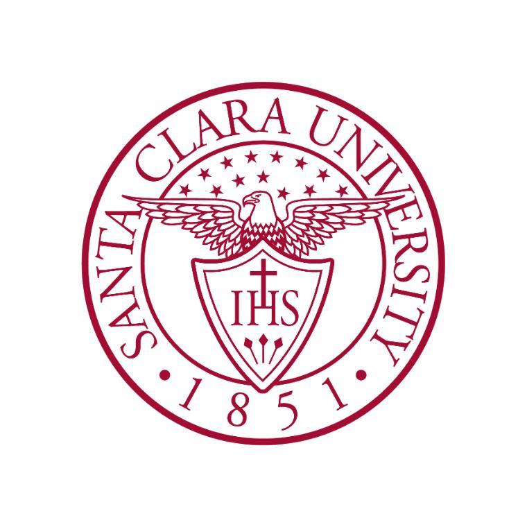
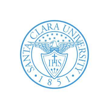
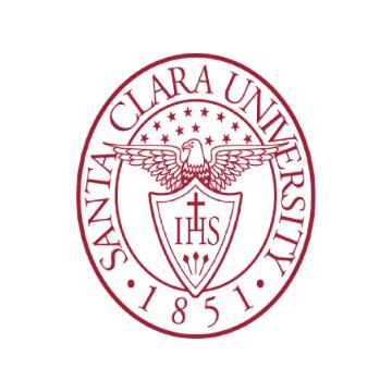
The SCU Seal
The Santa Clara University seal is adapted from the original seal used by the University’s founder and first president, John Nobili, S.J. It features the Jesuit cross resting on the letter “H,” with the three nails below representing the crucifixion of Christ. Thirteen stars, symbolizing the nation’s original 13 colonies, rest above the eagle’s head.
Historically, the seal has been reserved for official documents, such as presidential publications, diplomas, or other legal or academic documents. Today, the seal can also be used for a limited number of formal university-wide occasions, such as Commencement, as well as on certain official products.
Note: The dropped star on the right side of the eagle’s head is intentionally dropped. Please do not alter the stars in any way.
Incorrect Usage
The examples below highlight some, but not all, common misuses of our logo and seal. Never redraw or recreate any of our logos, including the Mission Symbol or Logotype. Any modification of our logos diminishes their impact and weakens our legal protection.
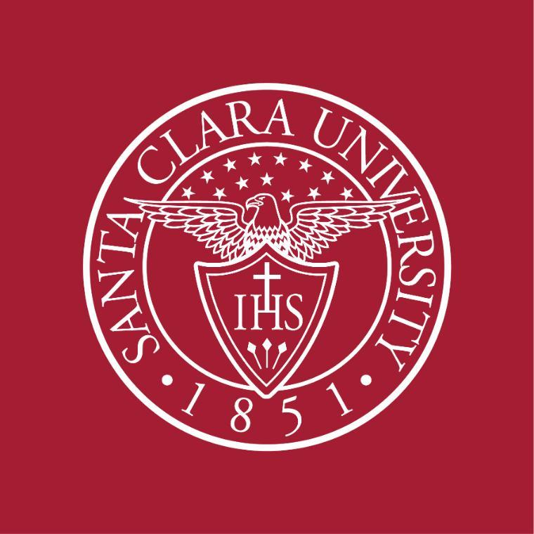
Do not alter the outside of the circular border.
Do not fill the background with color or screen tint.
Do not alter the color beyond the approved palette.
Do not scale the seal disproportionately.

Do not change the inside text of the seal.
Do not extract the eagle, or any part of the seal, from its whole.
Athletics Logo
The SCU Athletics logo represents the Santa Clara Broncos and is used for all branding related to the University’s athletic teams. For specific guidelines on the Athletics logo, contact Staci Gustafson, Deputy Director in Athletics.![]()