Contents on This Page
If you need help with any of our visual elements, please contact Colin Buckner, Art Director in University Marketing and Communications.
Brand Color Palette
Primary Colors
Santa Clara University has used red and white as its official colors since its earliest days. Our Primary Color Palette is the cornerstone of our visual identity and should take precedence in most high-level brand communications. Within this Primary Palette, Santa Clara Red and White are our main colors. Bronco Red (used most significantly by Athletics), Stone, and Black are used as supporting colors.
PMS 201 C
CMYK 7 / 100 / 68 / 32
RGB 163 / 32 / 53
HEX #A32035
CMYK 0 / 0 / 0 / 0
RGB 255 / 255 / 255
HEX #FFFFFF
PMS 202 C
CMYK 30 / 95 / 75 / 30
RGB 134 / 38 / 51
HEX #862633
PMS 7544 C
CMYK 58 / 41 / 34 / 4
RGB 121 / 136 / 154
HEX #758592
CMYK 0 / 0 / 0 / 100
RGB 0 / 0 / 0
HEX #000000
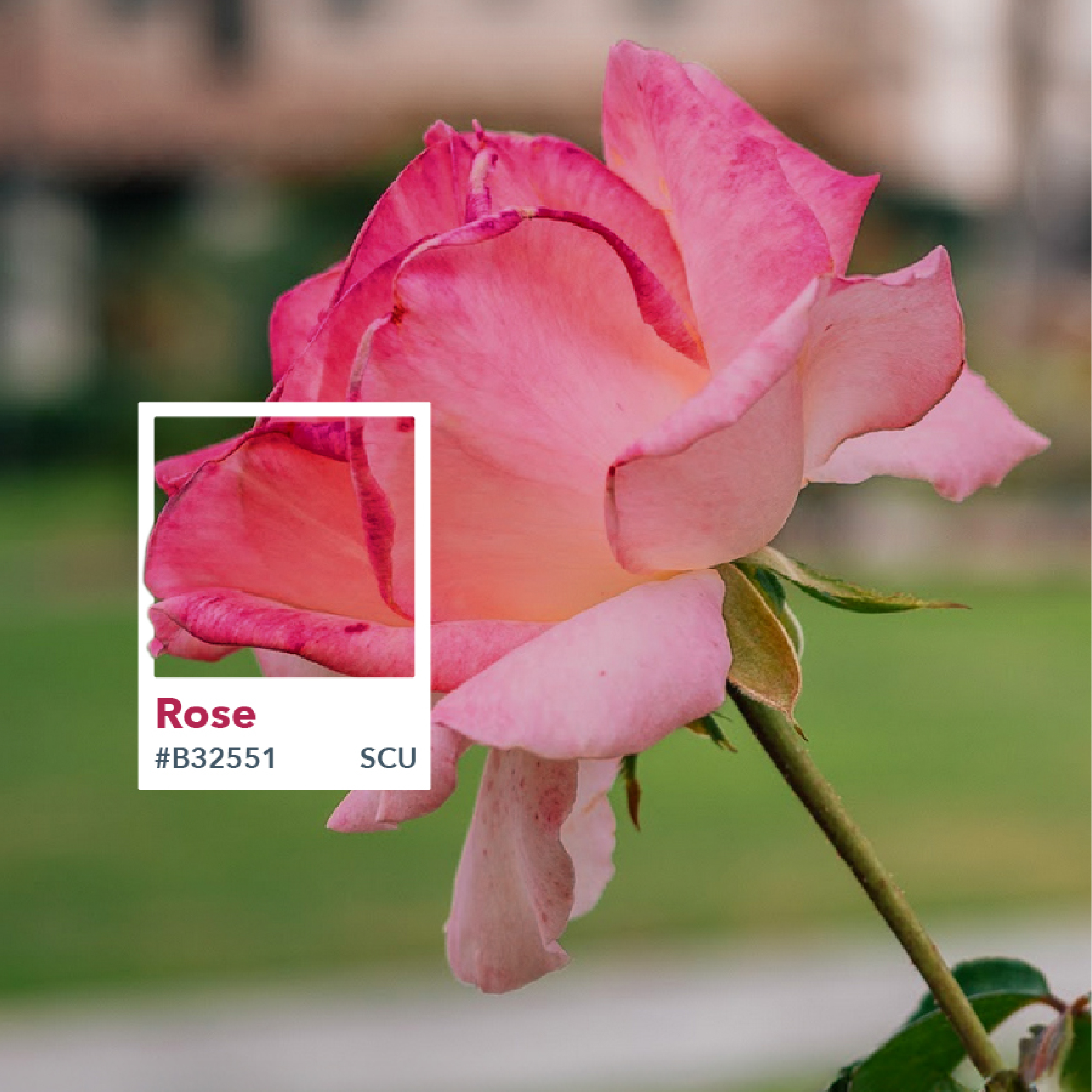
Secondary Colors
Our Secondary Color Palette offers flexibility and variety, reflecting the diversity within our community and the beauty of our campus. The hues and color names were carefully selected to complement the primary colors and highlight our rich history and the flourishing plant life in our campus environment. By drawing on nature, these colors evoke feelings of warmth, inclusiveness, and serenity, aligning with our university’s values.
Note: Our Sunrise color, which appears in our logo, is part of our Secondary Palette. However, it should be used sparingly and never as the dominant color in our communications.
CMYK 13 / 76 / 86 / 2
RGB 209 / 92 / 56
HEX #D15C3B
CMYK 0 / 72 / 65 / 0
RGB 247 / 109 / 89
HEX #F76D59
CMYK 21 / 86 / 100 / 13
RGB 177 / 62 / 19
HEX #B13E13
CMYK 0 / 22 / 100 / 2
RGB 255 / 182 / 0
HEX #FFB600
CMYK 1 / 16 / 95 / 0
RGB 255 / 210 / 32
HEX #FFD220
CMYK 18 / 57 / 100 / 4
RGB 201 / 121 / 0
HEX #C97900
CMYK 68 / 36 / 100 / 22
RGB 85 / 113 / 46
HEX #55712E
CMYK 27 / 0 / 90 / 0
RGB 198 / 217 / 68
HEX #C6D944
CMYK 79 / 41 / 100 / 40
RGB 39 / 84 / 12
HEX #27540C
CMYK 72 / 35 / 33 / 3
RGB 77 / 135 / 152
HEX #4D8798
CMYK 45 / 0 / 40 / 0
RGB 137 / 214 / 176
HEX #89D6B0
CMYK 91 / 52 / 43 / 20
RGB 17 / 93 / 111
HEX #115D6F
CMYK 75 / 53 / 0 / 0
RGB 73 / 116 / 187
HEX #4974BB
CMYK 45 / 11 / 0 / 0
RGB 123 / 194 / 249
HEX #7BC2F9
CMYK 96 / 86 / 10 / 1
RGB 43 / 67 / 143
HEX #2B438F
CMYK 58 / 72 / 9 / 0
RGB 127 / 94 / 156
HEX #7F5E9C
CMYK 20 / 54 / 0 / 0
RGB 207 / 135 / 205
HEX #CF87CD
CMYK 71 / 92 / 24 / 10
RGB 99 / 53 / 115
HEX #633573
CMYK 23 / 98 / 56 / 9
RGB 179 / 37 / 81
HEX #B32551
CMYK 0 / 84 / 36 / 0
RGB 255 / 77 / 114
HEX #FF4D72
CMYK 33 / 100 / 60 / 33
RGB 129 / 0 / 57
HEX #810039
Tertiary/Neutral Color
Our Tertiary/Neutral Color Palette is the final component of our color system. Inspired by the tones and textures found around our campus, this palette can be used to create depth and interest while maintaining a cohesive and elegant look that works in harmony with the Primary and Secondary Color Palettes.
CMYK 11 / 11 / 14 / 0
RGB 224 / 218 / 211
HEX #E0DAD3
CMYK 5 / 5 / 6 / 0
RGB 239 / 236 / 233
HEX #EFECE9
CMYK 30 / 25 / 29 / 0
RGB 181 / 177 / 172
HEX #B5B1AC
CMYK 5 / 7 / 21 / 0
RGB 241 / 231 / 204
HEX #F1E7CC
CMYK 2 / 3 / 9 / 0
RGB 249 / 243 / 229
HEX #F8F3E5
CMYK 20 / 19 / 31 / 0
RGB 206 / 195 / 174
HEX #CEC3AE
CMYK 25 / 31 / 47 / 0
RGB 194 / 169 / 139
HEX #C2A98B
CMYK 5 / 6 / 10 / 0
RGB 240 / 233 / 226
HEX #F0E9E2
CMYK 42 / 46 / 59 / 12
RGB 142 / 123 / 102
HEX #8E7B66
CMYK 77 / 58 / 44 / 24
RGB 66 / 87 / 102
HEX #425766
CMYK 17 / 11 / 10 / 0
RGB 208 / 213 / 217
HEX #D0D5D9
CMYK 80 / 64 / 55 / 50
RGB 42 / 55 / 63
HEX #2A373F
Typography
Consistent use of typography across all communications creates a strong and recognizable visual identity. This consistency reinforces our core values and messaging across all touchpoints. Our carefully selected brand typefaces are an essential component of our brand identity.
Primary Typeface
Our primary brand type family is Avenir Next. It is a versatile and modern geometric sans-serif typeface that functions well as body text and as headlines. Avenir Next has a clean design construction, approachable neutrality, and has been developed not only for print legibility but also to meet the demands of digital environments. Its wide range of weights, glyphs, and multilingual support make it accessible and consistent on many different platforms.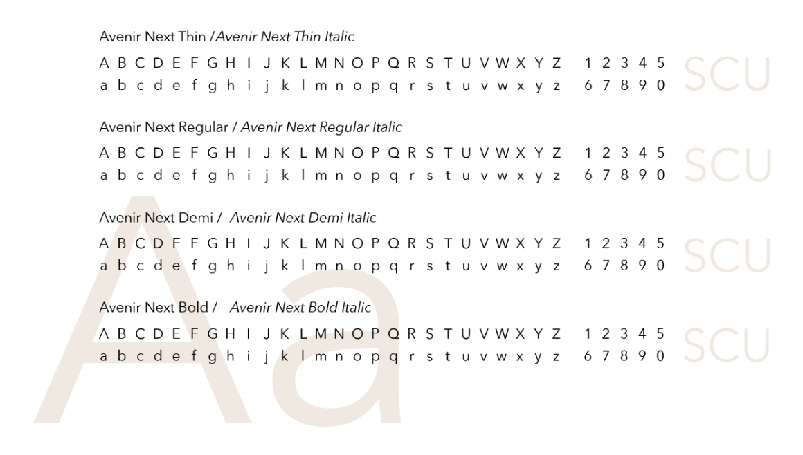
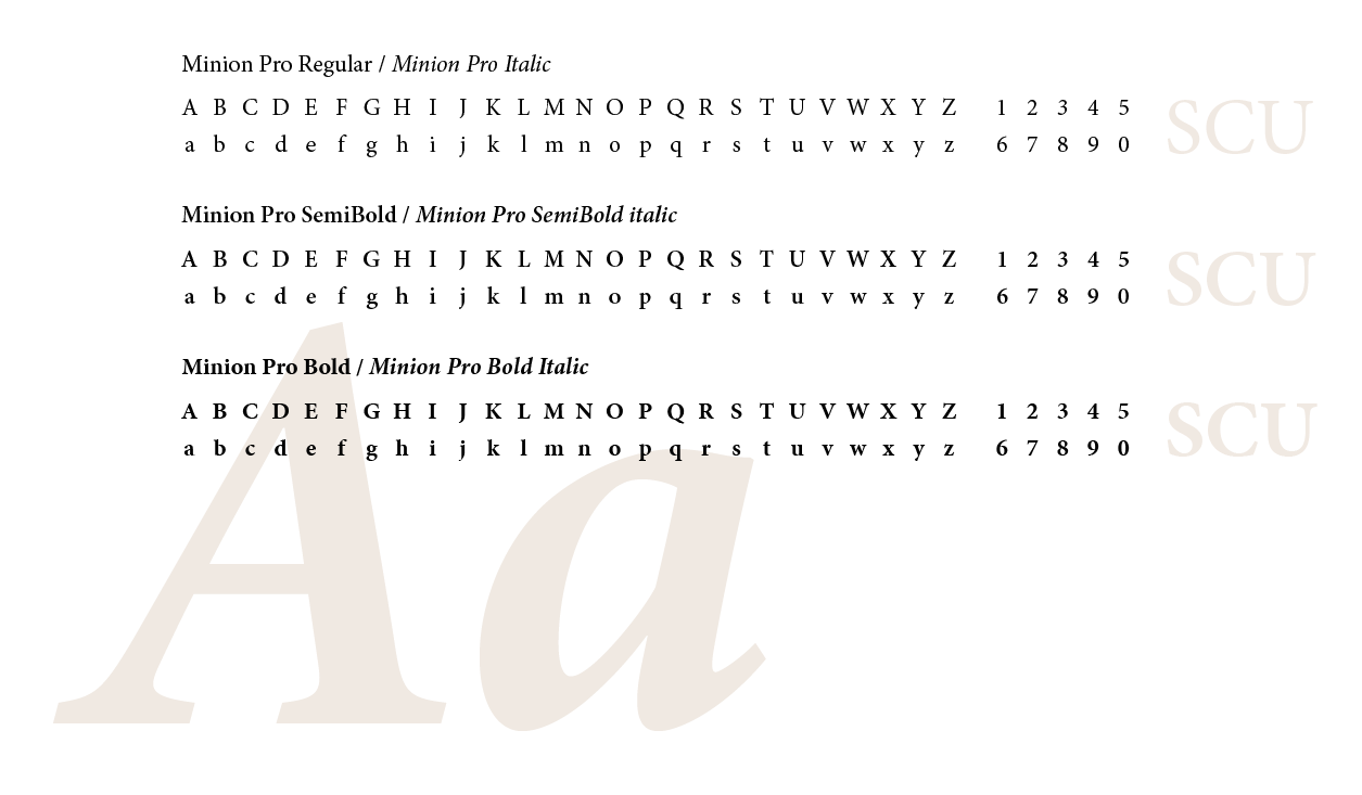
Secondary Typeface
Minion Pro is our secondary brand type family. This supporting typeface is inspired by classic, old-style typefaces. It has balanced proportions, moderate contrast between thick and thin strokes, and is supported by serifs for enhanced readability. Suitable for both body text and headlines, Minion Pro combines classic aesthetics with modern functionality.
Minion Pro complements Avenir Next because of its understated elegance. Use Minion Pro for pull quotes and/or elevated communications that require an extra degree of sophistication, such as commencement announcements or letters from the President.
Alternate Typeface
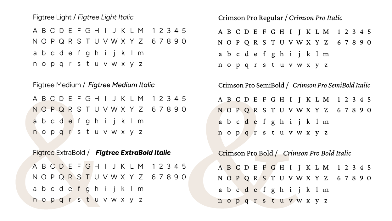
If our brand typefaces are unavailable we have two substitutes. Whenever possible, we strongly encourage the use of our brand typefaces but our alternates are suitable for general communications such as PowerPoint presentations and Word documents. In lieu of Avenir Next, use the typeface Figtree. In lieu of Minion Pro, use the typeface Crimson Pro.
Our alternate typefaces have been selected as substitutes because they are widely available and have many of the same design characteristics of our primary and secondary brand typefaces.
Google Font Download—Figtree
Google Font Download—Crimson Pro
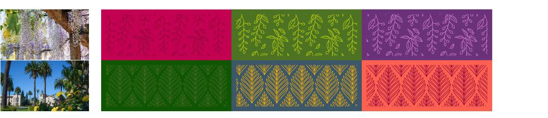
Patterns
We have three collections of patterns: Shield, Mosaic/Tile, and Campus Foliage. These collections offer a range of options while remaining neutral enough to be interchangeable.
Our patterns should be used as textural elements to add subtle visual interest to compositions. They can be used to cover wide fields or as thin bands. Use these patterns sparingly and only with intention. Be careful to avoid large fields of high contrast patterns as this can tire the eyes. Each of these patterns has been developed using shared principles so that the pattern libraries can be expanded upon as needed. New patterns should be designed to fit into one of our three collections and should follow the same design principles.
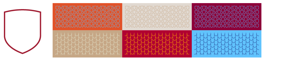
Shield
Our shield patterns are the closest translation of our brand into patterns. Inspired by the shape of our shield, this makes the clearest connection to our University Logo. These patterns are also representative of the Spanish tile roofs that sit atop many of SCU’s historic buildings.
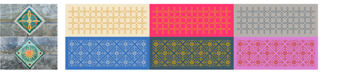
Mosaic/Tile
Also found throughout our campus, mosaics and tiles add color and life to many of our buildings. This rich history and culture of tile work translates well to repeatable patterns.
Campus Foliage
Our campus landscaping makes for a beautiful and inspiring environment. The translation of this foliage into patterns reflects our commitment to sustainability.