Improved local navigation for mobile users
The Mobile Optimized layout changes the position of the sidebar navigation in mobile views. By default that's positioned to follow the primary page content, and so local navigation links aren't prominently displayed when the page is viewed in the small window of a mobile device - viewers need to scroll all the way to the end of the page to find the menu.
Applying the Mobile Optimized layout fixes that - viewers will see the collapsed navigation menu at the top of the page, below the title and breadcrumb trail. You'll see that if you're viewing this page on a mobile device now, or if you resize a desktop browser window to a narrow width.
One cautionary note, however - this layout change will position all sidebar content above the main content, not just the sidebar navigation menu. So if you're including additional secondary content in the sidebar (event lists, related links, etc.) the Mobile Nav layout may not be the best choice.
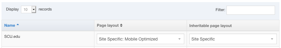
You can apply this selectively to an individual section, and set all other sections in the branch to use the standard Site Specific layout. Here's how to set that in the section's Page Layout properties.